Behavior Insights
Overview
Behavior Insights reports enable you to compare audiences based on their online behaviors as manifested in data collected in various Behavior modules.
Each Behavior module is represented by one or more reports. These reports enable you to view the affinity of the selected audiences and baseline audiences.
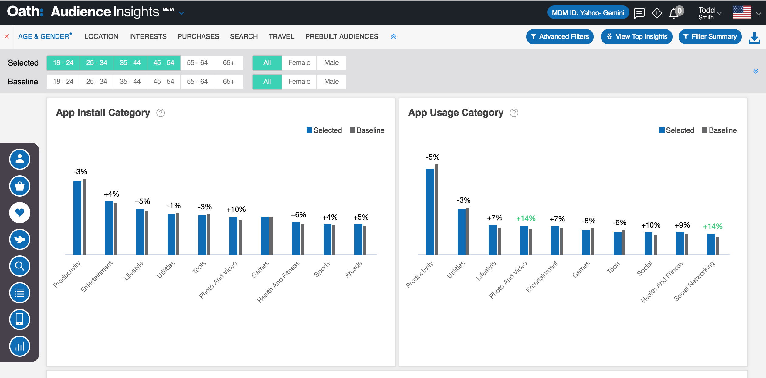
Fig. 61 Behavior Insights Reports
The Audience Insights console displays the following behavior reports:
|
|
|
App Install Category
The App Install Category report shows the distribution of selected audiences and baseline audiences across multiple app categories.
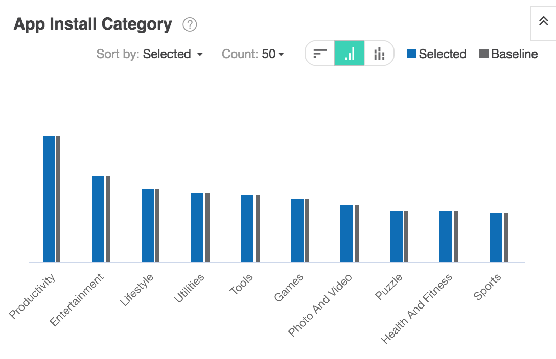
Fig. 62 App Install Category
Using controls in the console, you can configure the App Install Category report to highlight different aspects of the data:
- The report may be displayed as a horizontal bar chart, vertical bar chart, or stacked bar chart.
- Data may be sorted by affinity, by percentage of selected users, or by percentage of baseline users.
- By default, the report shows the distribution of audiences across ten app categories. Use the Count dropdown list to define the number of app install categories installed.
App Install Category report data is based on previous 30 days of app download data. To learn more, see App Behavior module data sources.
App Usage Category
The App Usage Category report shows the distribution of selected audiences and baseline audiences based on the apps that they use.
Fig. 63 App Usage Category
Using controls in the console, you can configure the App Usage Category report to highlight different aspects of the data:
- The report may be displayed as a horizontal bar chart, vertical bar chart, or stacked bar chart.
- Data may be sorted by affinity, by percentage of selected users, or by percentage of baseline users.
- By default, the report shows the distribution of audiences across ten app categories. Use the Count dropdown list to choose the number of app usage categories displayed.
App Usage Category data is based on length of time that an app is in use. To learn more, see App Behavior module data sources.
App Activity Daily Trend
The App Activity Daily Trend report shows the distribution over time of consumer app activity.
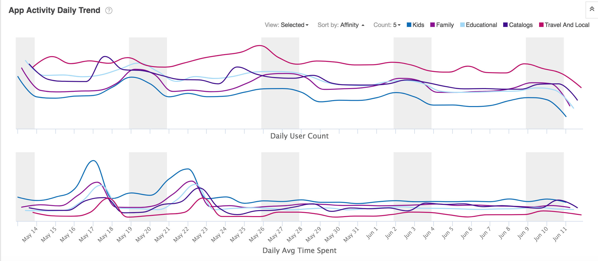
Fig. 64 App Activity Daily Trend Report
Using controls in the console, you can configure the App Activity Daily Trend report to highlight different aspects of the data:
- Data may be sorted by affinity, by percentage of selected users, or by percentage of baseline users.
- By default, the report shows the distribution of audiences across three app activity types. Use the Count dropdown list to change the number of apps displayed.
App Activity Daily Trend data is based on length of time that an app is in use. To learn more, see App Behavior module data sources.
App Intra Day Activity Trend
The App Intra Day Activity Trend report displays two table charts that show the percentage of selected audiences or the affinity of audiences across the days of the week and hours of the day.
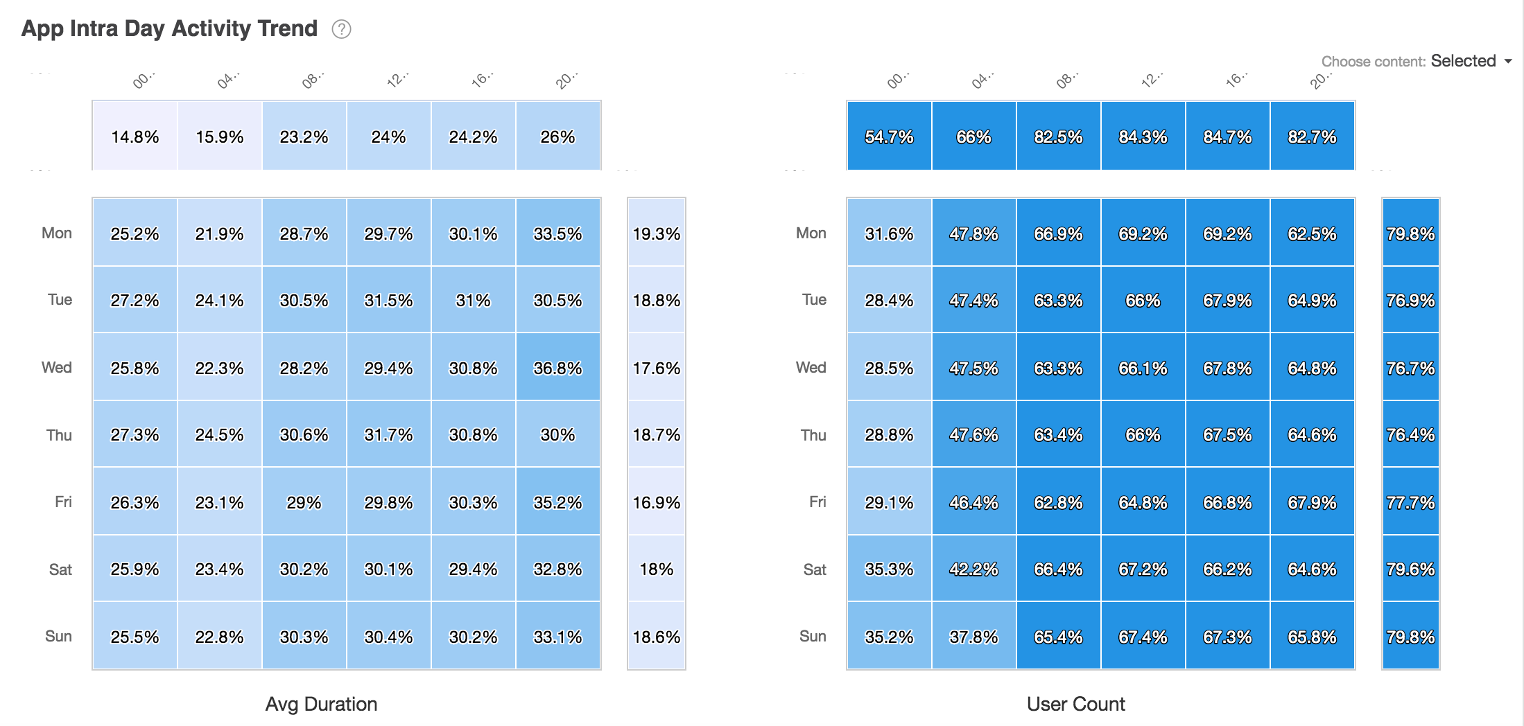
Fig. 65 App Intra Day Activity Trend
The report can display the percentage by consumers based on selected users or affinity.
- The Avg Duration table chart shows the average duration duration (in minutes) that an audience spends during the week.
- The User Count table chart shows the percentage of consumers using the app during the week.
App Intra Day Activity Trend data is based on length of time that an app is in use. To learn more, see App Behavior module data sources.
Top External Site Visits
The Top External Site Visits report shows the distribution of ad-hoc audiences (selected users and baseline users) by Internet domains visited.
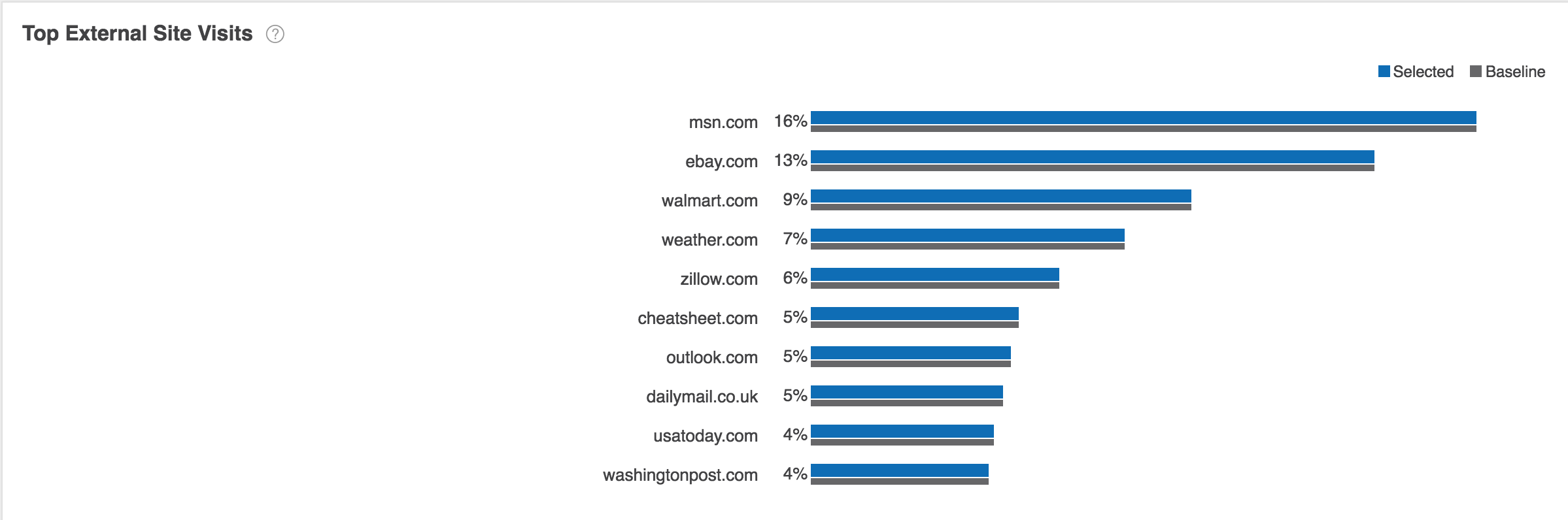
Fig. 66 Top External Site Visits Report
Using controls in the console, you can configure the Top External Site Visits report to highlight different aspects of the data:
- The report may be displayed as a horizontal bar chart, vertical bar chart, or stacked bar chart.
- Data may be sorted by affinity, by percentage of selected users, or by percentage of baseline users.
- By default, the report shows the distribution of audiences across ten domains. Use the Count dropdown list to choose the number of domains displayed.
Top External Site Visits data is based on data collected from unique consumer IDs where we can identify external sites visited. To learn more, see Top External Site Visits module data sources.
Device Usage
The Device Usage report shows the distribution of usage of various device types such as mobile, desktop, and tablet for selected app users against a baseline set of app users.
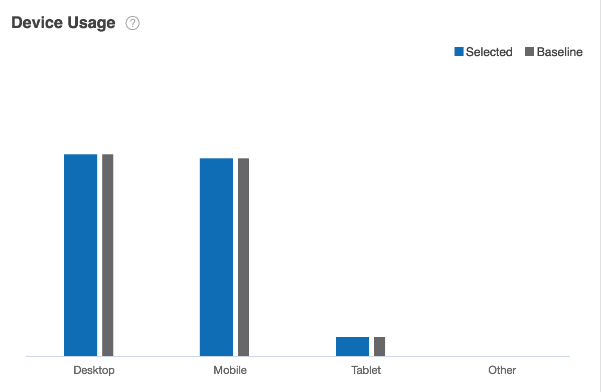
Fig. 67 Device Usage Report
The report may be displayed as a horizontal bar chart, vertical bar chart, or stacked bar chart.
Device Usage report data is based upon Ad Behavior module data. To learn more, see Ad Behavior module data sources.
Ad Clicker
The Ad Behavior report shows the distribution of ad behavior based on clicks and conversions for selected users exposed to an ad against a baseline set of users exposed to an ad.
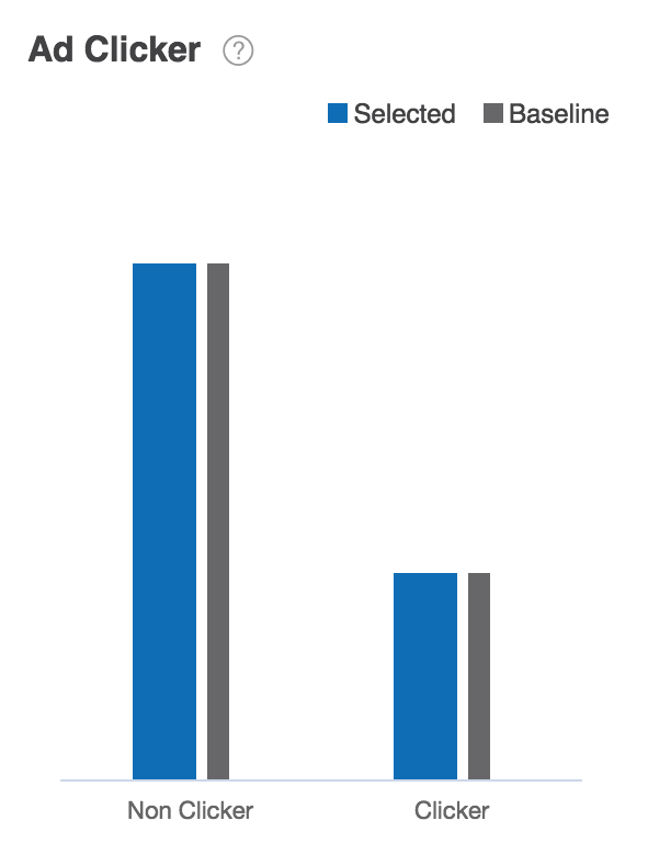
Fig. 68 Ad Clicker
The report may be displayed as a horizontal bar chart, vertical bar chart, or stacked bar chart.
Ad Clicker report data is based upon Ad Behavior module data. To learn more, see Ad Behavior module data sources.
Ad Converter
The Ad Behavior report shows the distribution of ad behavior based on clicks and conversions for selected users exposed to an ad against a baseline set of users exposed to an ad.
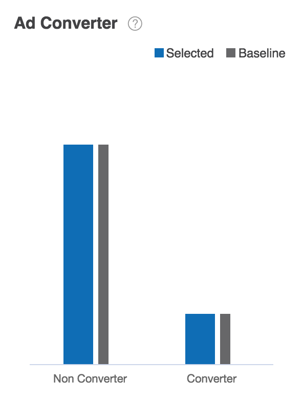
Fig. 69 Ad Converter
The Ad Converter report may be displayed as a horizontal bar chart, vertical bar chart, or stacked bar chart.
Ad Converter report data is based upon Ad Behavior module data. To learn more, see Ad Behavior module data sources.
Yahoo Interest Categories (Level 1)
Yahoo Interest Categories reports show the distribution of selected users and baseline users by Yahoo Interest Category.
The Yahoo Interest Categories (Level 1) report displays the most common top-level Yahoo Interest Categories. For example, Business and Industry, Entertainment, and Sports.
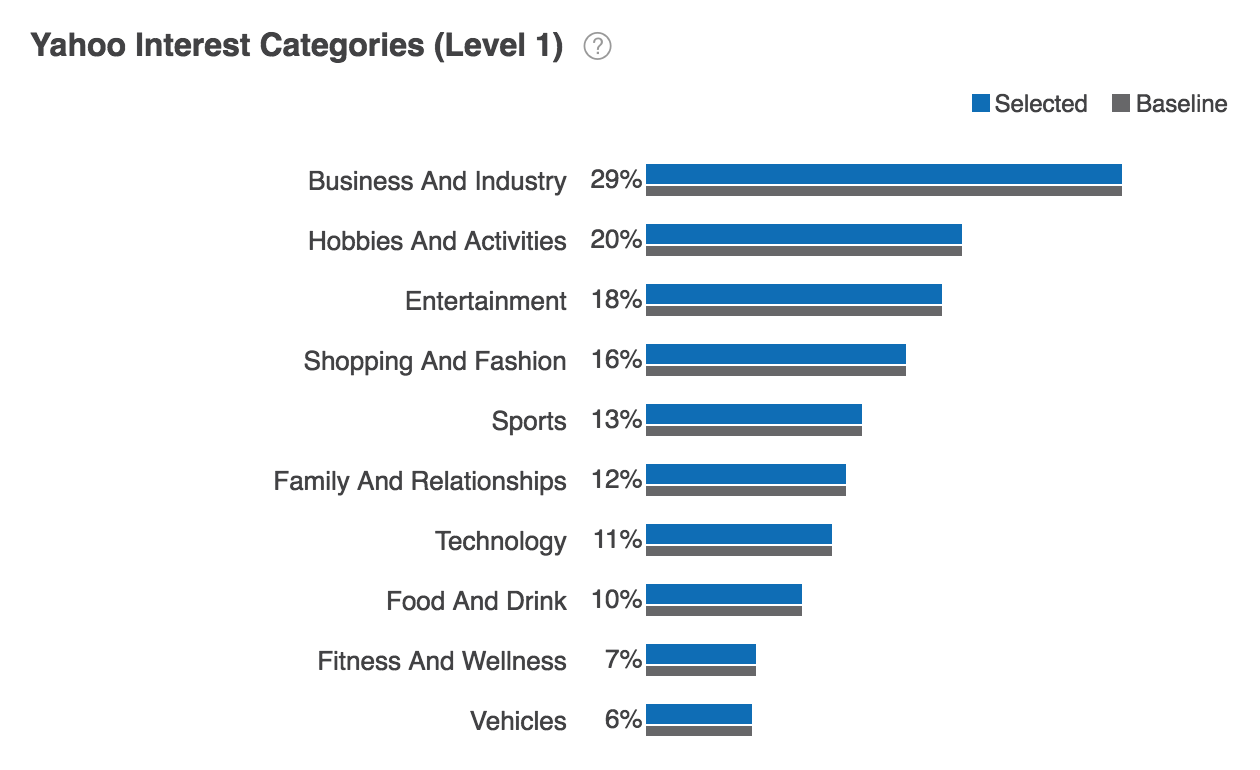
Fig. 70 Yahoo Interest Categories (Level 1) Report
Yahoo Interest Categories are organized hierarchically. Each Level 1 Yahoo Interest Category contains multiple secondary Level 2 categories.
- The Yahoo Interest Categories reports may be displayed as a horizontal bar chart, vertical bar chart, or stacked bar chart.
- Data can be sorted by affinity, by percentage of selected users or baseline users, or alphabetically by Yahoo Interest Category.
Yahoo Interest Category data is derived from Yahoo data (consumption, clicks, etc.) collected from Yahoo properties and pages. To learn more, see Yahoo Interest Categories module data sources.
Yahoo Interest Categories (Level 2)
Yahoo Interest Categories reports show the distribution of selected users and baseline users by Yahoo Interest Category.
The Yahoo Interest Categories (Level 2) report displays the most common secondary Yahoo Interest Categories. For example, Business and Industry > Online, Business and Industry > Personal Finance, and Business and Industry > News.

Fig. 71 Yahoo Interest Categories (Level 2) Report
- The Yahoo Interest Categories reports may be displayed as a horizontal bar chart, vertical bar chart, or stacked bar chart.
- Data can be sorted by affinity, by percentage of selected users or baseline users, or alphabetically by Yahoo Interest Category.
Yahoo Interest Category data is derived from Yahoo data (consumption, clicks, etc.) collected from Yahoo properties and pages. To learn more, see Yahoo Interest Categories module data sources.
In Market Auto (Style)
The In Market Auto report shows the distribution of users in the market for an automobile based on vehicle style or make compared to a baseline set of users.
The In Market Auto (Style) report displays the top automobile style categories returned. For example, Full Size Sedan, Luxury Sedan, and Sports Car/Convertible.
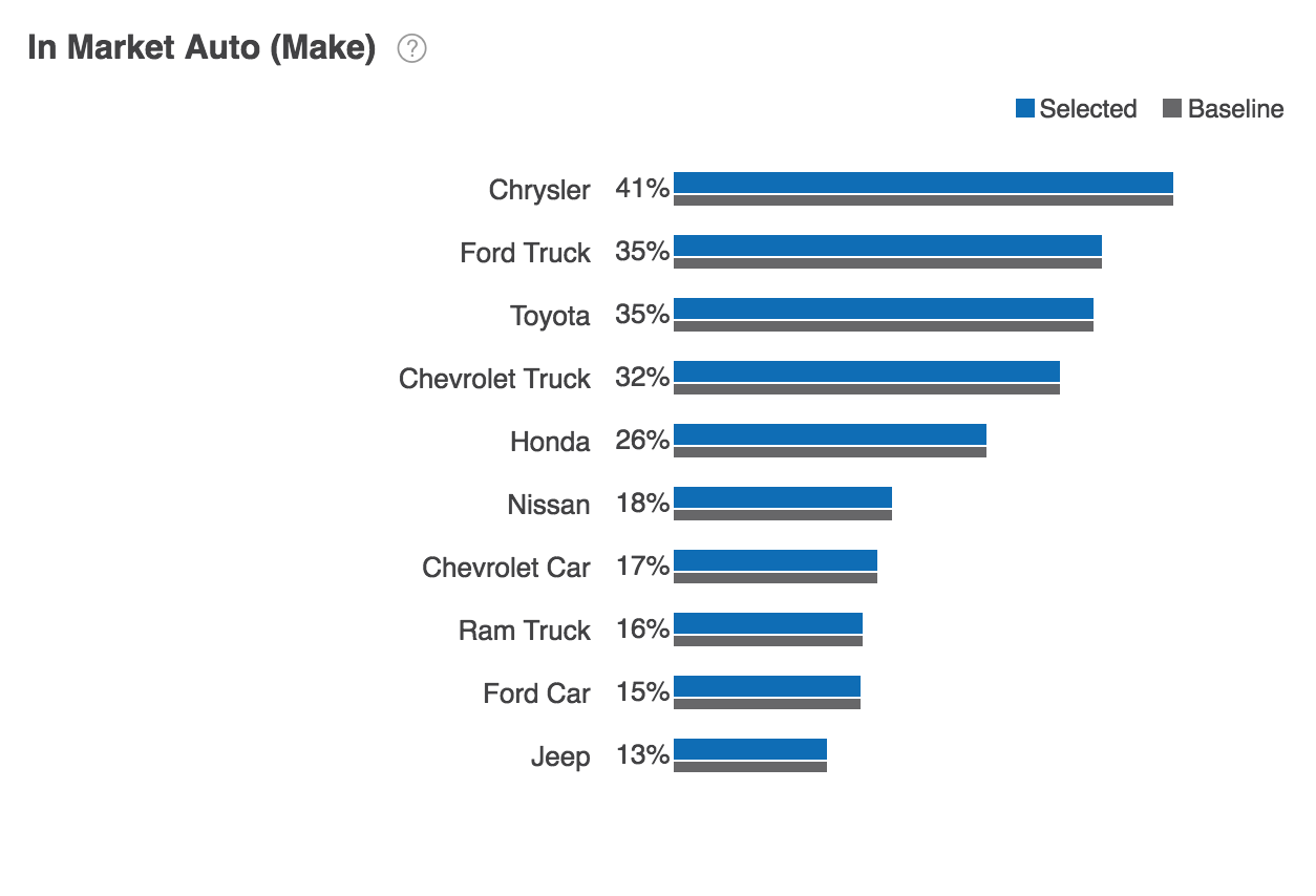
Fig. 72 In Market Auto (Style) Report
Using controls in the console, you can configure the In Market Auto report to highlight different aspects of the data:
- The report may be displayed as a horizontal bar chart, vertical bar chart, or stacked bar chart.
- Data may be sorted by affinity, by percentage of selected users, or by percentage of baseline users.
- By default, the report shows the distribution of audiences across ten app categories. Use the Count dropdown list to choose the number of auto make categories displayed.
In Market Auto report data is derived from Yahoo data sources and represents all unique consumer IDs where we can identify readiness or interest in buying an automobile. To learn more, see In-Market Auto.
In Market Auto (Make)
The In Market Auto (Make) report displays the top automobile make categories. For example, Chrysler, Toyota, and Ford Truck.
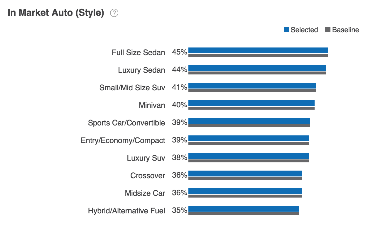
Fig. 73 In Market Auto (Make) Report
Using controls in the console, you can configure the In Market Auto report to highlight different aspects of the data:
- The report may be displayed as a horizontal bar chart, vertical bar chart, or stacked bar chart.
- Data may be sorted by affinity, by percentage of selected users, or by percentage of baseline users.
- By default, the report shows the distribution of audiences across ten app categories. Use the Count dropdown list to choose the number of auto make categories displayed.
In Market Auto report data is derived from Yahoo data sources and represents all unique consumer IDs where we can identify readiness or interest in buying an automobile. To learn more, see In-Market Auto.
Top POI Categories Visited
The Top POI Categories Visited report displays distribution of selected audiences and baseline audiences by categories of point of interest locations.
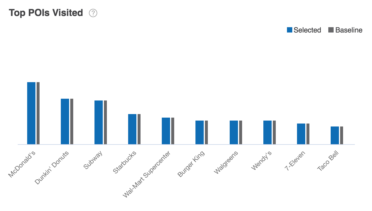
Fig. 74 Top POI Categories Report
Using controls in the console, you can configure the Top POI Categories Visited report to highlight different aspects of the data:
- The report may be displayed as a horizontal bar chart, vertical bar chart, or stacked bar chart.
- Data may be sorted by affinity, by percentage of selected users, or by percentage of baseline users.
- By default, the report shows the distribution of audiences across ten app categories. Use the Count dropdown list to choose the number of POI categories displayed.
Top POI Category Visits report data is based on previous 30 days of POI data. To learn more, see POI module data sources.
Top POI Visited
The Top POI Visited report displays distribution of selected audiences and baseline audiences by point of interest locations.
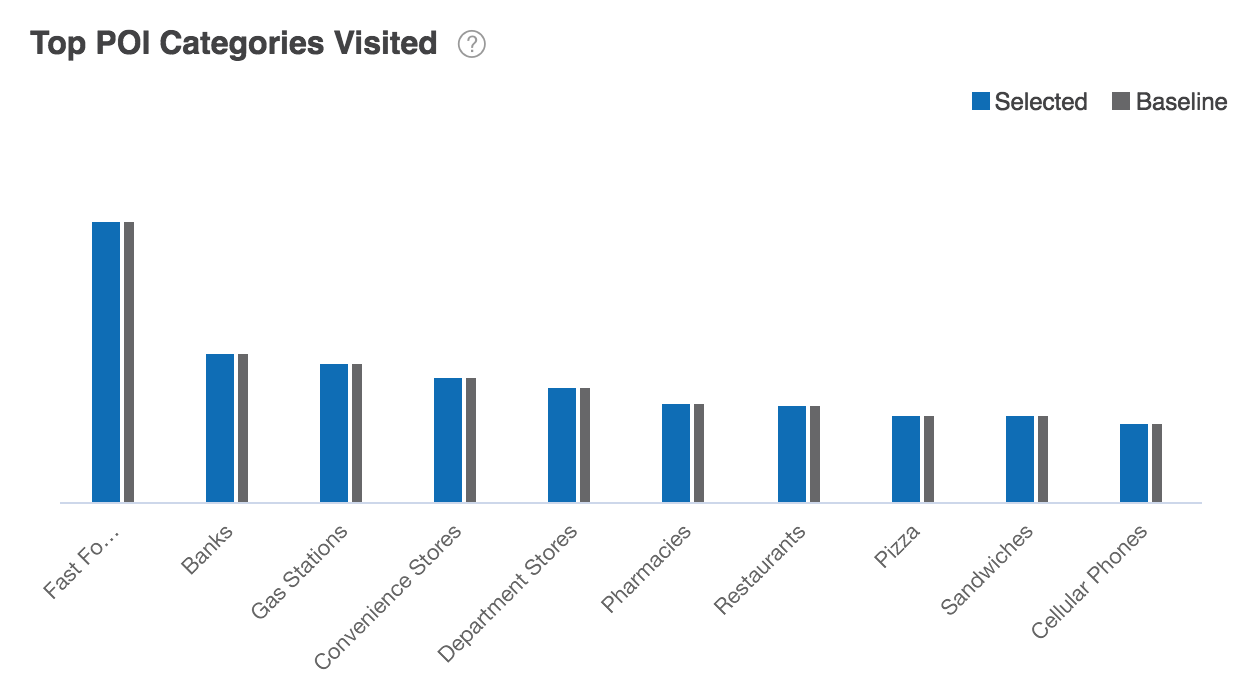
Fig. 75 Top POI Visited Report
Using controls in the console, you can configure the Top POI Categories Visited report to highlight different aspects of the data:
- The report may be displayed as a horizontal bar chart, vertical bar chart, or stacked bar chart.
- Data may be sorted by affinity, by percentage of selected users, or by percentage of baseline users.
- By default, the report shows the distribution of audiences across ten app categories. Use the Count dropdown list to choose the number of POI categories displayed.
Top POI Visits report data is based on previous 30 days of POI data. To learn more, see POI module data sources.
In Market Home
The In Market Home report shows the distribution of users shopping for a home vs new movers for selected users compared against a baseline set of users.

Fig. 76 In Market Home Report
Data can be sorted by affinity, by percentage of selected users or baseline users, or alphabetically by app behavior.
In Market Home report data is derived from Yahoo data sources and represents all unique consumer IDs where we can identify residence. To learn more, see In-Market Home.